.svg)
.svg)
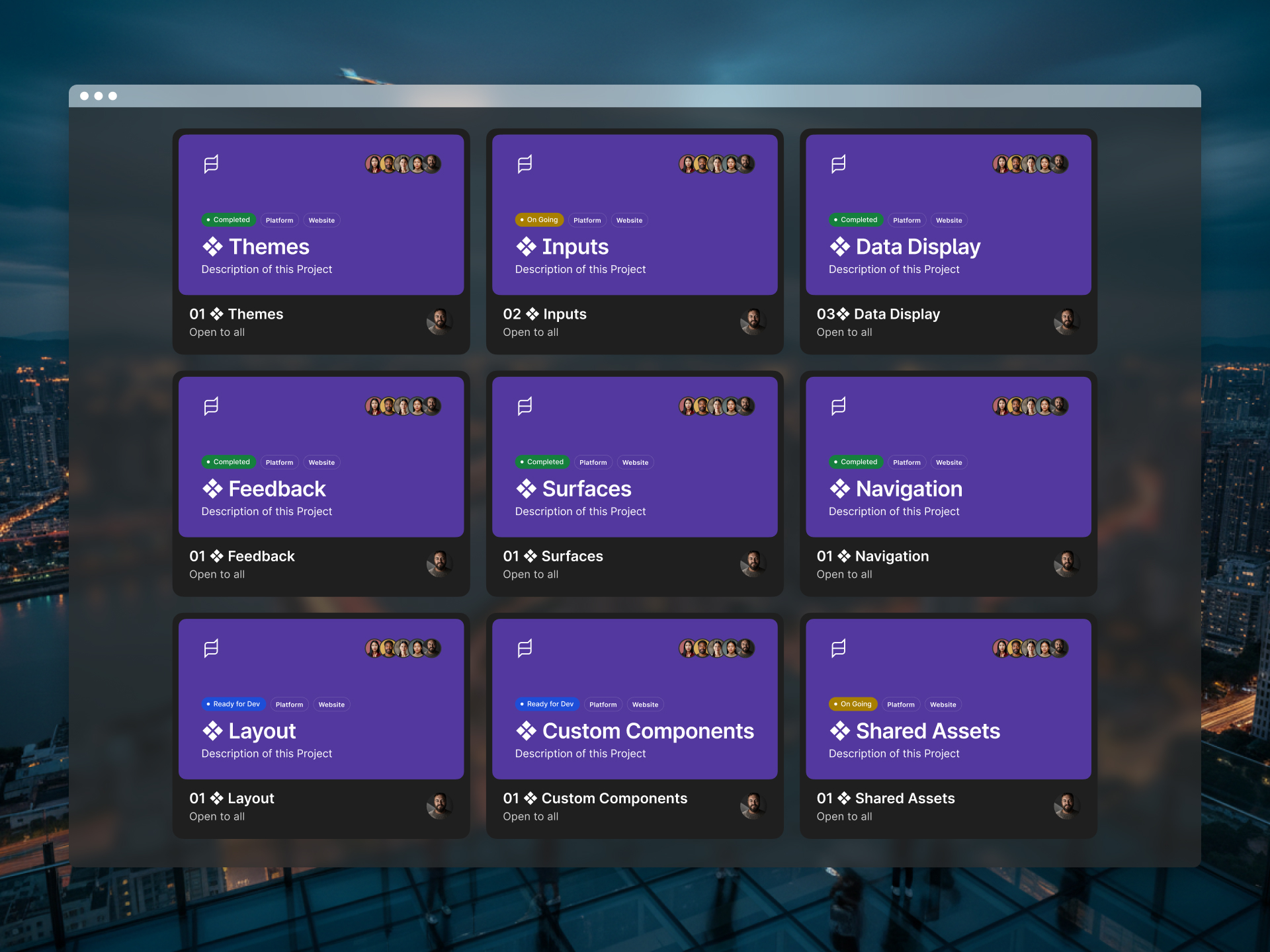
As the platform expanded across multiple products, workflows and customer types, maintaining consistency became increasingly difficult.
Teams were solving similar problems repeatedly.
Patterns evolved independently.
Accessibility standards varied between features.
Engineering teams often interpreted the same requirement in different ways.
The problem wasn’t a lack of good design.
The problem was a lack of shared foundations.
Every new feature introduced additional complexity, increased implementation effort and created more opportunities for inconsistency.
The challenge wasn’t designing better screens.
It was creating a system that allowed teams to make better decisions repeatedly.
One of the biggest shifts in my thinking was recognising that individual screens were no longer the most valuable design deliverable.
As products mature, the challenge becomes less about creating isolated solutions and more about creating systems that help teams solve problems consistently over time.
Rather than approaching the work feature by feature, I treated it as a platform-wide foundation.
The goal was to create a shared language between design and engineering while reducing duplication, strengthening accessibility and supporting long-term scalability.
Several principles guided the work:
- Improve consistency across products
- Reduce design and engineering duplication
- Strengthen accessibility standards
- Accelerate product development
- Create a shared implementation language
- Support future platform growth
The objective wasn’t simply creating components.
It was creating a framework for decision-making.
Every decision was guided by a simple question:
Would this make future work easier, faster and more consistent?
Building Semantic Foundations
One of the earliest decisions was moving away from component-specific styling.
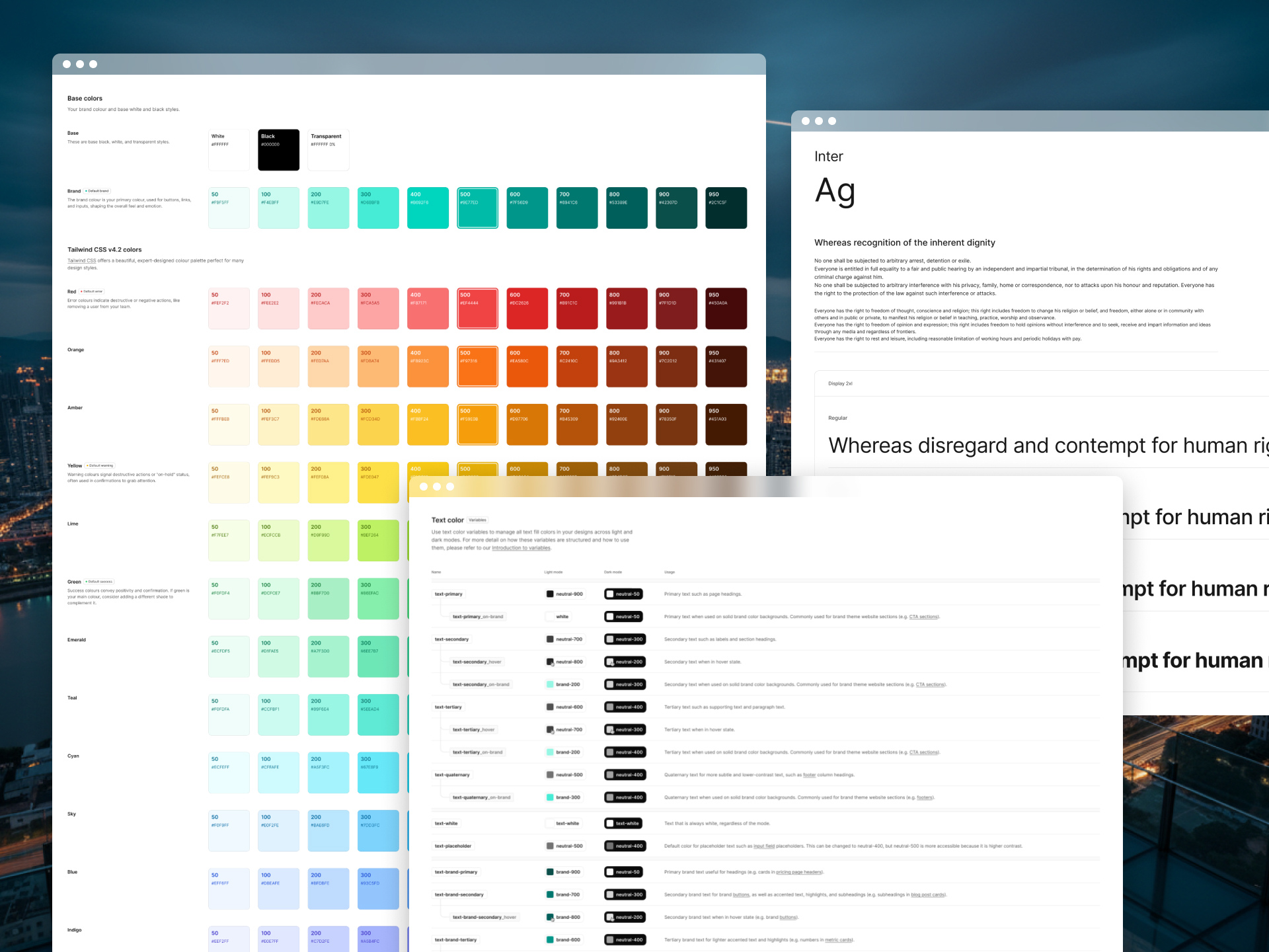
Rather than tying decisions directly to visual appearance, I introduced semantic design tokens that reflected intent.
This created a more resilient foundation capable of supporting future themes, product evolution and accessibility improvements without requiring large-scale redesigns.
Making Design Decisions Together
One principle guided the entire project:
If design and engineering disagreed during implementation, the conversation had started too late.
Whenever I explored a new component, pattern or interaction, I worked closely with front-end engineers to understand the foundations already available within MUI and our existing architecture.
Sometimes the best solution wasn’t creating something new.
Sometimes it was adapting an existing pattern that engineering already knew how to support and scale.
These discussions happened before design decisions were finalised, allowing us to evaluate trade-offs together and arrive at solutions that worked both from a user experience and implementation perspective.
By the time work reached implementation, both teams had already agreed on the approach, significantly reducing ambiguity and rework.
The result was a system that wasn’t just easier to use.
It was easier to build, maintain and evolve.
Connecting Design To Implementation
One of the most common sources of inconsistency occurs during handoff.
Design intent gets translated differently across teams.
To reduce interpretation, I introduced a scalable variable architecture that aligned design decisions directly with implementation, creating a clearer connection between design and code.
Prioritising Accessibility From The Start
Accessibility is often treated as a later enhancement.
I deliberately approached it as a foundational requirement.
Colour systems, typography, interaction patterns and component behaviour were designed with accessibility in mind from the beginning rather than being retrofitted later.
Creating A Shared Language
The most valuable outcome wasn’t a component library.
It was creating a common vocabulary that allowed designers and engineers to discuss problems, solutions and implementation decisions using the same framework.
When teams share language, they make better decisions faster.
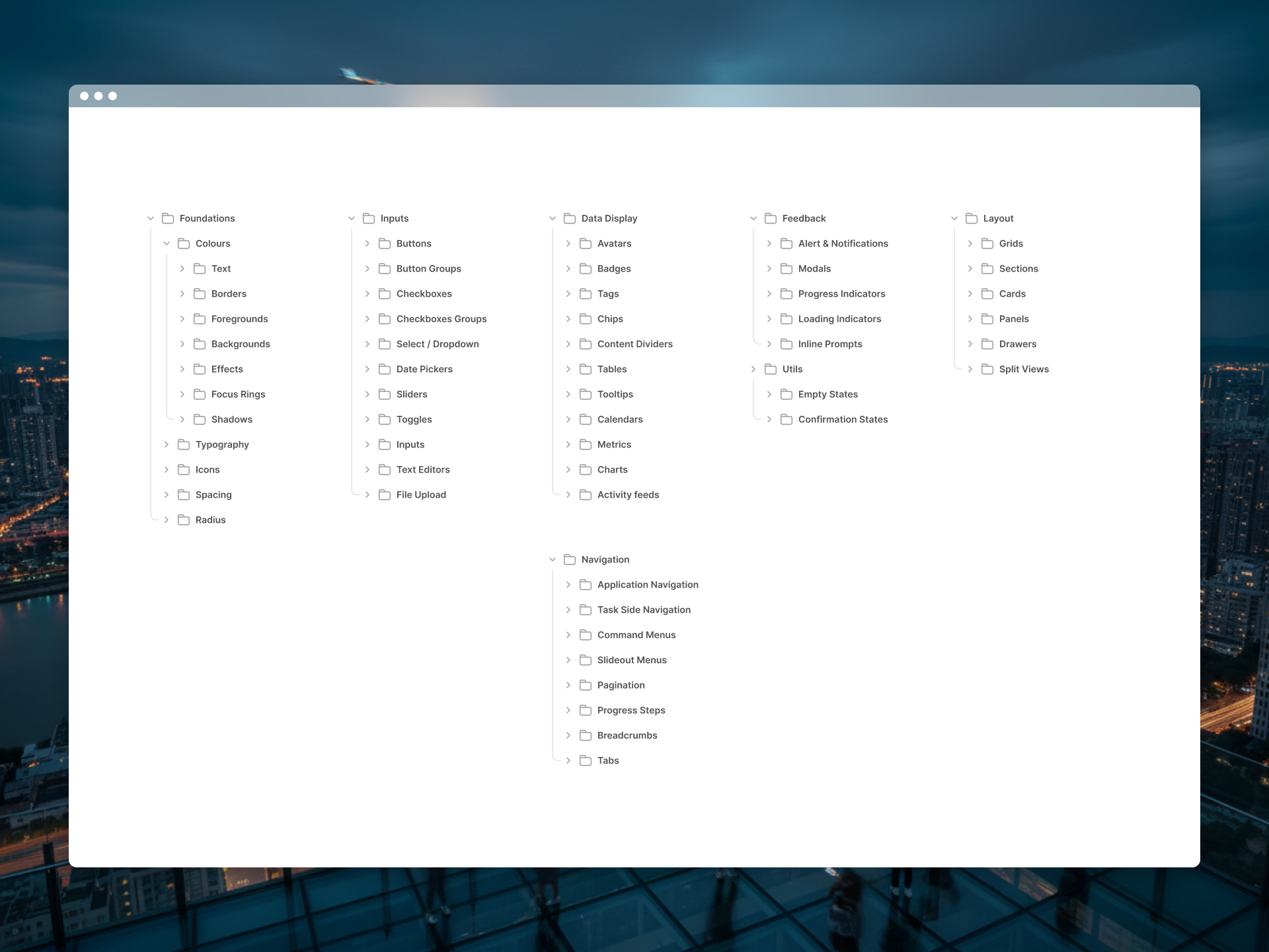
The final foundation combined design standards, accessibility principles and implementation guidance into a scalable system designed to support future product development.
The system included:
- Semantic design tokens
- Colour foundations
- Typography scales
- Spacing systems
- Reusable components
- Form patterns
- Navigation patterns
- Data display patterns
- Feedback and status components
- Accessibility standards
- Documentation and implementation guidance
Rather than prescribing individual screen designs, the system provided teams with the building blocks required to create consistent experiences across the platform.
My goal wasn’t to build a component library.
It was to create a system that made good decisions easier to repeat.
Looking back, the biggest success wasn’t the number of components created.
It was changing how teams approached product development.
The platform moved away from designing individual screens in isolation and towards building reusable systems capable of supporting long-term growth.
The foundation delivered:
- Greater consistency across products
- Reduced design and engineering duplication
- Stronger accessibility standards
- Faster implementation of new features
- Improved collaboration between teams
- Greater confidence when scaling the platform
This project reinforced something I’ve learned throughout my career.
Great products aren’t built from individual screens.
They’re built from systems that help teams make consistently good decisions over time.
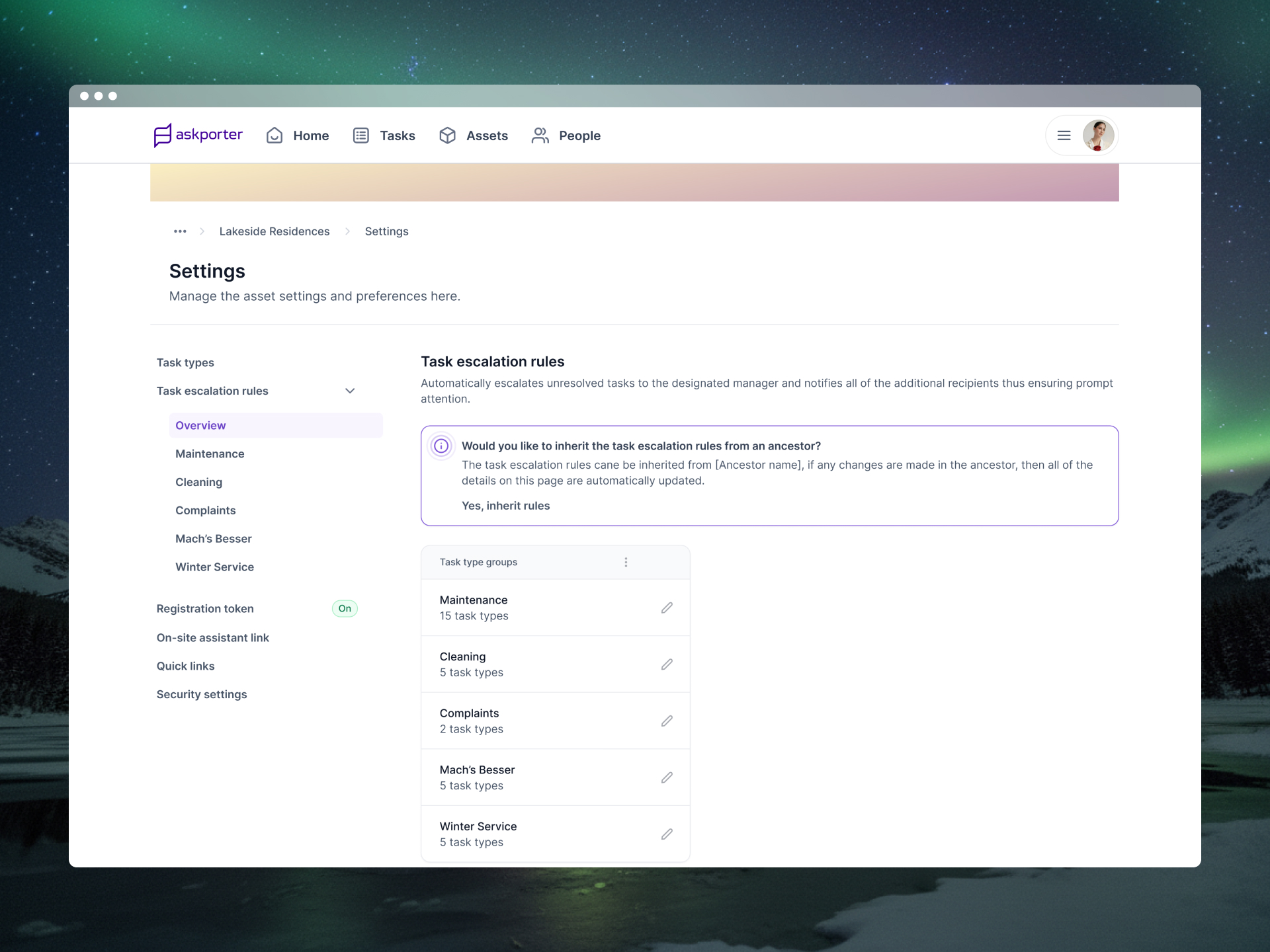
LET’S MAKE CLARITY A HABIT.
Have a product, platform, or operational challenge in mind?
I help organisations simplify complexity, create scalable foundations, and build digital products that deliver lasting value.